
-
 ARTIST SPOTLIGHTTransparency as authenticity? Ronald Clyne and his cover art for Folkways
As Richard Carlin has noted in his book, Worlds of Sound, there was something different about a Folkways record:
The front “cover” consisted of a paper wrapper glued over a plain sleeve, the black cardboard textured like aged leather. The wrapper only reached about one-third of the way around the back of the album, and a list of the tracks to be heard within sometimes was printed on the back to give you a clue of what you were buying. Inside the sleeve, a heavy piece of cardboard was inserted to create two pockets. In one, a booklet of notes was inserted, sometimes as little as four pages, but more often expanding to thirty or more pages of background notes, photographs, and song lyrics; in the other pocket the record was placed, somewhat heavier than a typical vinyl album. Folkways albums were decidedly different; difficult to find in record stores outside of major cities, priced higher than normal albums, treasured and passed eagerly from listener to listener, their very obscurity making them that much more desirable (2008: xv-xvi).
Ronald Clyne, who designed an estimated 500 covers for Folkways Records, contributed to the distinctive “otherness” of its recordings. The physical alterity of a Folkways record was not the end of the matter. The label also had a special philosophy, and Clyne’s design complemented it well.
There was something quite different about the whole Folkways operation. Founder Moses Asch produced more than 2,000 recordings for the label between its inception in 1948 and his death in 1986, and these recordings ran the gamut, from classical, jazz, blues, and folk, to the very edges of recorded sound and market viability.
Asch’s ambitious life work combined a “preservationist” ethic, a political project, and an ideology of presenting, in as faithful a manner as possible, the real and authentic (Carlin 2008). Although he was interested in recording technology, Asch was always more concerned with content rather than questions of “high fidelity.” Indeed, his productions were often accused of being decidedly “lo-fi.” This was partly a question of finances, but also a function of Asch’s beliefs both in making sounds available (again), as well as in a certain approach to recording. Asch was an enthusiast of mono recording, at a time when his contemporaries were experimenting with stereo. He also did not believe in artificially boosting certain ranges in the sound spectrum, preferring to record as “flat” as possible.
Ronald Clyne: Visualising transparency?
Cover illustrations and designs offered another way in which the contents of a Folkways record were mediated to the listener. And they were one further point of distinction from the competition. Asch began releasing records at a time when plain paper sleeves were the norm; by the 1950s, Folkways record covers had become an instantly recognizable brand within the market. Visual aesthetics were not a matter of peripheral concern. Indeed Asch was to boast at one stage that his was the first record label to issue records with cover art (in 1945, he enlisted David Stone Martin to do the cover art for a series of jazz recordings). As Moses Asch biographer Peter Goldsmith notes, however, Asch did not initiate the practice; yet he did take it to “new heights” (1998: 134). Whilst artists like David Stone Martin, Ben Shahn, and Irwin Rosenhouse contributed original cover art, particularly in the early days of the label, it would eventually be Ronald Clyne’s covers that established a house style.
A relatively little-known figure nowadays, Clyne (1925–2006) was the son of an advertising executive. A modernist by inclination, the New Yorker was both a freelance graphic designer as well as a painter. He designed book jackets for a variety of publishing houses, including the sci-fi and fantasy Arkham House imprint, and he also designed record covers for some other labels, notably Vanguard. Yet it is his Folkways work with which he is most identified. The Folkways brief was a welcome one for Clyne. Although it was not highly remunerating, the work provided considerable artistic freedom. There was also some overlap between his own interest in tribal, or what he called “world” art, and the label’s large “Ethnic Folkways” sub-catalogue. As British designer Adrian Shaughnessy has noted, that deep interest lent his “Ethnic Folkways” designs a special integrity and sure touch far removed from the touristic designs of some of the contemporary “exotica” releases on other record labels (2010: 61).
Beginning in the mid-1950s, Clyne would increasingly be the designer of choice for Asch. This is not to say, however, that he was the only designer, or that his designs always followed the same principles. The look with which Clyne’s designs are associated was partly a result of aesthetic choices, and partly one of material realities. To the latter must be reckoned the low budget of Folkways Records. Whilst Clyne typically worked with two-colour printing—and made a virtue out of it—occasionally only one colour was available. The use of cheaper matte printing stock also contributed to the Folkways look. This, together with Clyne’s frequent predilection for autumn tones, contributed to an “earthiness,” which could easily be rhymed with the homespun, “authentic” nature of the music that the records contained.
Two other aspects of Clyne’s designs must be mentioned here: His use of typography, together with his featuring of photography. Given the volume of covers that Clyne designed, any comments about his typographic choices can only be partial. Nevertheless, Clyne’s most typical (and effective) designs used type in a very “clean” manner. These exhibit a great typographic economy, especially when using sans serif fonts, which is very much in key with Clyne’s overall design precepts. If some of the recordings of the folk revival featured an excess of antique, “junk shop” ornamentation, then Clyne the minimalist often avoided this.
The other salient aspect is Clyne’s use of photography (an element in which Asch also took a keen interest). This is not innocent—witness the fact that Clyne was an accomplished painter, yet his Folkways designs almost never featured his paintings. An exception here is his early cover for Sounds of New Music (1958), a collection of modern compositions by John Cage, Henry Cowell, and others. The accent on photography had economic, ideological, and personal reasons. Having a respect for “world art,” Clyne doubtless felt that a photograph might best do justice to the content of an “Ethnic Folkways” album. He always maintained a significant file of photographs that were in the public domain. This reflected both a need to keep design costs down, and the fact that Folkways was itself peddling a link between its content and the public domain.
There was also a deeper association between photography and the documentary impulse behind Folkways. In many ways photography and Folkways shared the same ideology of transparency. If photography did not lie, then Folkways was also interested in “truth” and authenticity (not just in terms of the music and sounds that it sought to document, but also in terms of its “flat” recording philosophy). Beyond this, one can co-locate documentary photography and Folkways’ sonic documentation within the same progressive political context. As Robert Coles has indicated in his book, Doing Documentary Work (1997), many documentarians in mid-twentieth century America had a progressive politics in mind when they sought to take and publish their photographs and reportages. Just as progressive documentarians had photographed (and filmed and reported on) the poverty of Depression-era tenant farmers, Moe Asch was (re)publishing Woody Guthrie’s landmark Dust Bowl Ballads (1940), which related similar concerns in a different medium. In Clyne’s masterful design for the 1964 reissue, he complemented the record’s progressive politics and “documentary” impulse with a photograph-based cover that somehow conveyed the contents of the album (and its underlying ideology) in an austere, and “transparent” fashion, even if it did have a “earthy” undertone—indeed, one could almost feel the dust of which Guthrie sang.
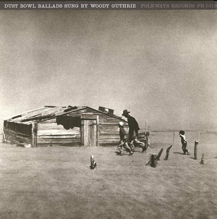
Dust Bowl Ballads, 1957 (FW05212)
Design by Ronald Clyne
An earlier version of this article was published in Idea: International Graphic Art and Typography 59.1 (No. 344), Jan. 2011: 139-146 (ISSN 0019-1299). It was also published as catalog text for an exhibition of Clyne's graphic work for Folkways at the Deska Inc. Gallery 5610, Tokyo, Japan (held between 17 Jan. 2011-11 Feb. 2002). This was part of a larger exhibition initiative organized by Warren Taylor, John Nixon, and Stephen Bram. Beginning in 2006, the exhibition was presented in galleries in Australia, New Zealand, and Japan. Click here for more information about these exhibitions.
Notes
Peter D. Goldsmith, Making People’s Music: Moe Asch and Folkways Records. (Washington and London: Smithsonian Institution Press, 1998); Tony Olmsted, Folkways Records: Moses Asch and his Encyclopedia of Sound. (London and New York: Routledge, 2003); Richard Newsome and Ronald Clyne, Six Hours with Ronald Clyne; Seeing the World of Sound: The Cover Art of Folkways Records exhibition catalog (University of Alberta, 2005); Richard Carlin, Worlds of Sound: The Story of Smithsonian Folkways (Washington and London: Smithsonian Books, 2008); Kevin Reagan, Alex Steinweiss: The Inventor of the Modern Album Cover (Cologne: Taschen, 2009); Tony Brook and Adrian Shaughnessy, “Ronald Clyne at Folkways,” Unit: Design/Research, Vol. 1 (2010); Robert Coles, Doing Documentary Work (New York: Oxford University Press, 1997); and a Smithsonian Folkways Recordings interview with Ronald Clyne (2006).
Dr. Andrew Wright Hurley is a lecturer in cultural studies at the University of Technology, Sydney, and is currently working on an Australian Research Council-funded project on representations of music in recent German literature.
©2010 by Andrew Hurley